


KAYAK is a travel search engine. Users use the search engine to search for flights, and then get taken to either the airline website or booking website to book their flight. While most users do not book their flight on KAYAK, they do offer an in house booking option for certain flights. This booking flow benefits KAYAK users in a number of ways including saved traveler information, paying in installments, trip planning tools, travel guides and more, all on one platform.
The Problem
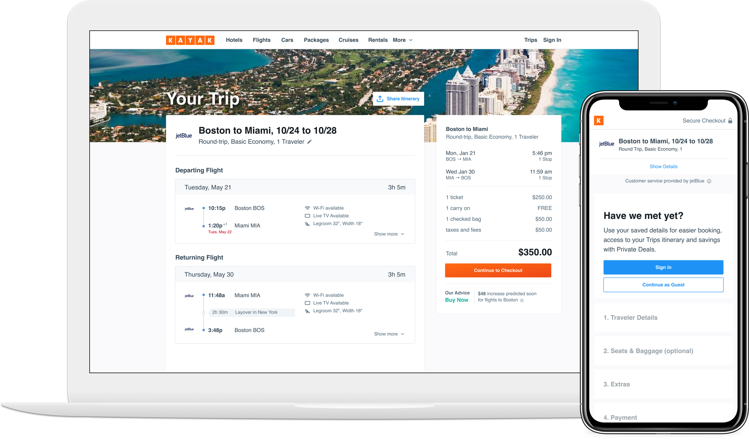
In 2018, the booking flow hadn’t been updated in years and was in need of some love. The tech needed to be refactored and we were breaking several UX best practices. The experience was functional, but less than optimal: a single page, loaded with input fields, up-sells and information. We took this opportunity to optimize the tech and the design of the booking flow.
The Approach
I began with a Jobs-to-be-Done brainstorm with my product manager, lead engineer and user research lead, to align on all the core features and edge cases. I then did competitive research on several booking sites. I found that most airline booking sites offered less than optimal user experiences and I was excited to make ours better. I based a lot of the design off Google Flights but also specifically researched booking and form best practices and made sure to incorporate them where Google was not. My goal was to make the booking flow as usable, accessible and frictionless as possible.
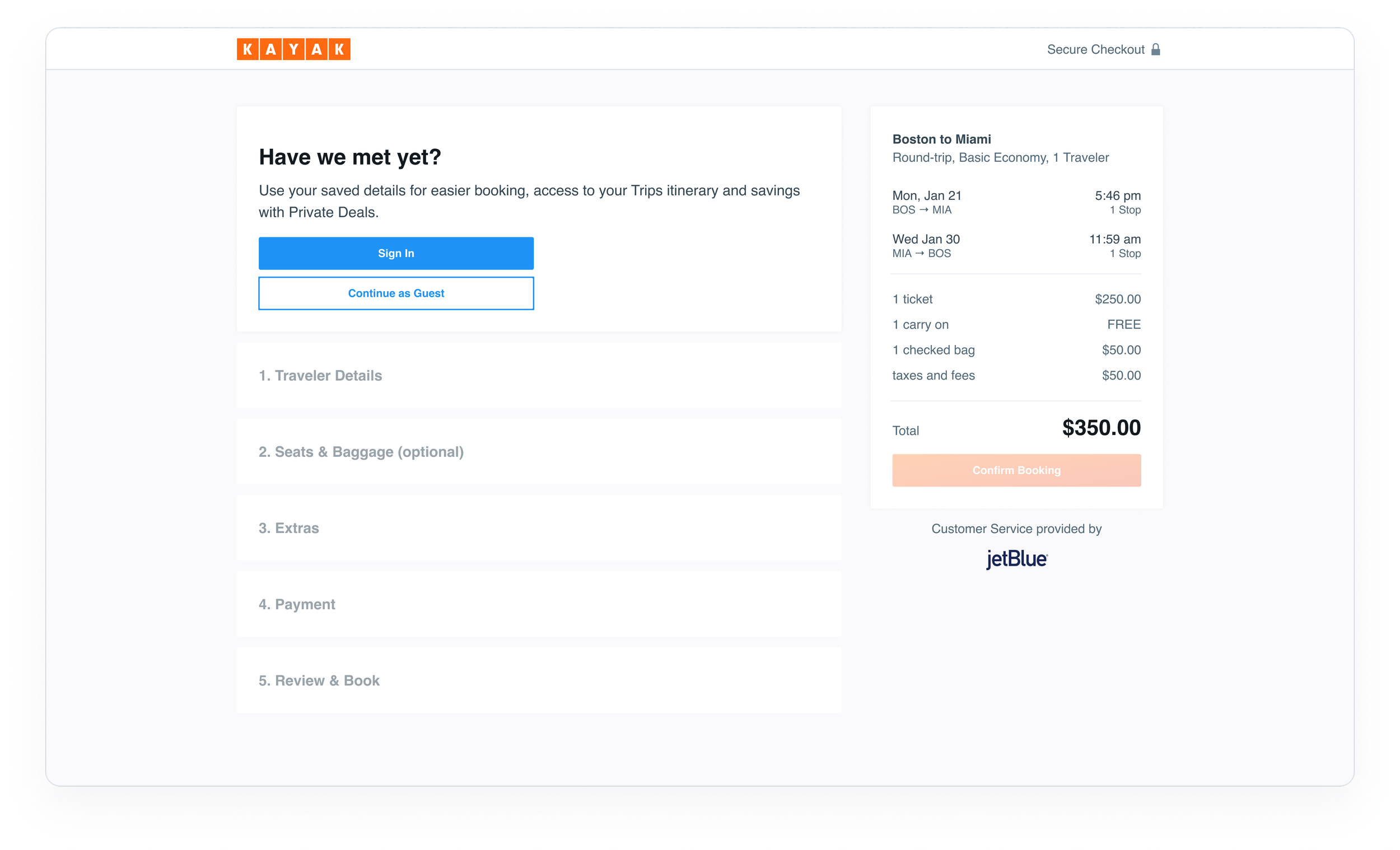
I designed a progressive disclosure booking flow that allows users to focus on one section of user inputs/actions at a time, helping to reduce cognitive load.
I added a “review trip” page prior to “continuing to checkout”. This page is intended to provide users with their flight details and fare families, giving them the confidence and information they need to proceed to booking.
Our hypothesis was that users who click “view deal” from the results page, are looking for more details and not necessarily ready to book – therefore creating a high bounce rate from the booking flow.
Lastly, I adopted KAYAK’s design system, ensuring that all patterns and components were modernized.
The Outcome
We successfully rolled out the new and improved booking flow across all platforms: desktop, mweb, iOS and android. Conversion rate increased and bounce rate decreased. We also increased marketing email sign ups, and logged in users states.